Note
Click here to download the full example code
result plots
three plots read the tables other functions return. grade_tonnage draws tonnage and mean grade above cutoff for
any grade-tonnage table, cross_validation draws the leave-one-out kriging results for an estimate, and contact
draws grade against distance to a geological contact. the page krigs and cross-validates walker lake V; the nickel
laterite horizons give the contacts.
import sys
from pathlib import Path

HERE = Path(__file__).parent if "__file__" in globals() else Path.cwd()
sys.path.insert(0, str(HERE.parents[1]))
import boitata as bt
import matplotlib.pyplot as plt
import numpy as np
from common import save

samples = bt.datasets.walker_lake()
xy, v = samples.coords, samples["V"]
azimuths = np.arange(0, 180, 22.5)
directional = [bt.experimental_variogram(xy, v, 10.0, 120.0, azimuth=a) for a in azimuths]
model = bt.Variogram.fit_directional(
    directional, [(a, 0) for a in azimuths], ["spherical", "spherical"], weighting="count/gamma"
)
search = bt.Search(radius=80, max_samples=24, min_samples=4, rotation=model.rotation, ratios=(0.5, 1.0))
kriging = bt.OrdinaryKriging(model, search).fit(xy, v)
cv = kriging.cross_validate()
cross-validation
kriging estimates each sample from its neighbors with itself left out. kind="scatter" sets the actual values
against these estimates. the regression of actual on estimate has a slope below 1 when high estimates are too high
and low ones too low (conditional bias). the box lists the mean error, RMSE, correlation and the mean of error² over
kriging variance, 1 when the variance is calibrated. kind="accuracy" tests whether the kriging variance gives
intervals of the right width: for each probability p, the fraction of samples inside their symmetric p interval
(gaussian, from estimate and variance). on the diagonal the intervals are right, above it too wide, below it too
narrow; the goodness statistic is 1 on the diagonal and penalizes narrow intervals twice as much as wide ones.
kind="errors" maps estimate minus actual at the samples, red over- and blue underestimates.
fig, (a, b, c) = plt.subplots(1, 3, figsize=(13, 4.2))
bt.plot.cross_validation(cv, ax=a)
a.set_title("Actual against estimate")
bt.plot.cross_validation(cv, kind="accuracy", ax=b)
b.set_title("Accuracy of the kriging intervals")
bt.plot.cross_validation(cv, kind="errors", coords=samples, ax=c)
c.set_title("Errors")
fig.tight_layout()
save(fig, "cross_validation")
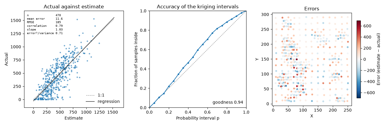
the slope is close to 1 and the mean error small against an RMSE of about 185. the accuracy curve runs above the
diagonal and error²/variance is 0.7: the kriging variance is too large for these errors, so its intervals are too
wide. it also depends on the data layout alone and ignores the local grade, and the gaussian interval ignores the
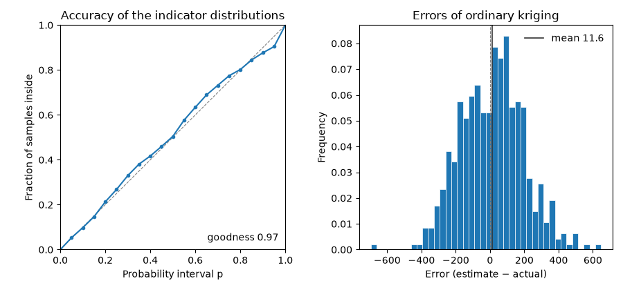
skew of V. indicator kriging builds each sample's distribution from indicators at several thresholds instead. its
cross-validation gives the probability of each actual value in its own distribution, and the same plot reads it:
the curve follows the diagonal. without coords, kind="errors" is a histogram.
thresholds = np.quantile(v, [0.1, 0.25, 0.5, 0.75, 0.9])
indicator = bt.MultipleIndicatorKriging(model, search, thresholds).fit(xy, v)
indicator_cv = indicator.cross_validate()
fig, (a, b) = plt.subplots(1, 2, figsize=(9, 4.2))
bt.plot.cross_validation(indicator_cv, kind="accuracy", ax=a)
a.set_title("Accuracy of the indicator distributions")
bt.plot.cross_validation(cv, kind="errors", ax=b)
b.set_title("Errors of ordinary kriging")
fig.tight_layout()
save(fig, "indicator_accuracy")
grade-tonnage curves
grade_tonnage takes the table of boitata.grade_tonnage, of an anamorphosis, of uniform conditioning or of
compare_models; a dict of tables, or a table with model or category columns, gives one color per curve.
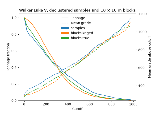
tonnage is solid on the left axis, mean grade dashed on the right. with relative=True each curve's tonnage is a
fraction of its tonnage at the lowest cutoff, so declustered samples and 10 × 10 m blocks share one axis. kriged
blocks against true blocks (block averages of the exhaustive grid) and against the samples show the smoothing:
kriging puts too much tonnage above low cutoffs and too little above high ones, at a lower grade than the true
blocks up to 300 ppm. the true blocks sit between the samples and the kriged blocks: averaging over 10 × 10 m
narrows the distribution, and kriging narrows it further.
blocks = bt.BlockModel(origin=(0.5, 0.5), size=(10, 10), count=(26, 30))
block_kriging = bt.BlockKriging(model, search, size=(10, 10), discretization=(5, 5, 1)).fit(xy, v)
truth = bt.datasets.walker_lake_exhaustive()["V"].reshape(300, 260)
blocks = blocks.with_columns(
    {"kriged": block_kriging.predict(blocks), "true": truth.reshape(30, 10, 26, 10).mean(axis=(1, 3)).ravel()}
)
cutoffs = np.arange(0, 1000, 25.0)
weights = bt.cell_declustering(xy, v, cell_size=20.0).weights
curves = {
    "samples": bt.grade_tonnage(v, cutoffs, weights=weights),
    "blocks": bt.compare_models(blocks, ["kriged", "true"], cutoffs, reference="true"),
}
fig, ax = bt.plot.grade_tonnage(curves, relative=True)
ax.set_title("Walker Lake V, declustered samples and 10 × 10 m blocks")
save(fig, "grade_tonnage")
contact analysis
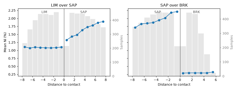
boitata.contact bins samples by distance along each hole to a contact between two domains, negative inside;
plot.contact draws the mean grade per bin on each side, with the sample counts as light bars. a jump at zero marks
a hard contact: estimate each domain from its own samples. a gradual change marks a soft one: share samples across
it. the 1 m nickel assays take the horizon logged over them. from limonite (LIM) into saprolite (SAP), Ni steps up
a little at the contact and keeps climbing for several meters: a soft contact. from saprolite into bedrock (BRK) it
falls from 2.2 to 0.3 % at once: a hard one.
data = bt.datasets.nickel_laterite_profile()
assays = bt.merge_intervals(data["assays"], data["horizons"])
points = bt.Drillholes(data["collars"], data["surveys"], assays).samples()
fig, axes = plt.subplots(1, 2, figsize=(10, 3.8), sharey=True)
for ax, (inside, outside) in zip(axes, [("LIM", "SAP"), ("SAP", "BRK")], strict=True):
    table = bt.contact(
        points,
        "NI_PCT",
        domain_column="HORIZON",
        holes="HOLE_ID",
        inside=inside,
        outside=outside,
        max_distance=8.0,
        bin=1.0,
    )
    bt.plot.contact(table, labels=(inside, outside), ax=ax)
    ax.set_title(f"{inside} over {outside}")
axes[0].set_ylabel("Mean Ni (%)")
axes[1].set_ylabel("")
fig.tight_layout()
save(fig, "contact")
Total running time of the script: ( 0 minutes 0.744 seconds)
Download Python source code: example_10_06.py