Note
Click here to download the full example code
correlations
an iron formation drilled by 187 diamond holes: hematite ore, compact (HC) and friable (HF), in itabirite, compact (IC) and friable (IF), with canga (CG), laterite (LAT) and mafic intrusions (MAF). every composite carries six oxides that share one whole, so they cannot vary independently. the correlations between them, and how fast those fade with distance, decide whether to estimate them together.
import sys
from pathlib import Path

HERE = Path(__file__).parent if "__file__" in globals() else Path.cwd()
sys.path.insert(0, str(HERE.parents[1]))
import boitata as bt
import matplotlib.pyplot as plt
import numpy as np
from common import save

data = bt.datasets.iron_formation_plateau()
intervals = bt.merge_intervals(data["assays"], data["lithology"])
holes = bt.Drillholes(data["collars"], data["surveys"], intervals)
OXIDES = ["FE_PCT", "SIO2_PCT", "AL2O3_PCT", "P_PCT", "MN_PCT", "LOI_PCT"]
composites = holes.composite(2.0, [*OXIDES, "DENSITY"], domain="LITH")
lith = composites["LITH"]
hematite = composites.filter(np.isin(lith, ["HC", "HF"]))
itabirite = composites.filter(np.isin(lith, ["IC", "IF"]))
print(f"{len(composites)} composites of 2 m: {len(hematite)} hematite, {len(itabirite)} itabirite")
Out:
24875 composites of 2 m: 7585 hematite, 13403 itabirite
correlation matrices
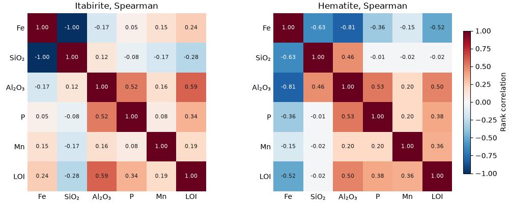
correlation returns the pearson or rank (spearman) correlation matrix of some columns, each pair over the rows where
both are present, optionally weighted. plot.correlation draws it with every cell written out. the rank correlation
is the safer one on skewed grades.
labels = ["Fe", "SiO₂", "Al₂O₃", "P", "Mn", "LOI"]
fig, axes = plt.subplots(1, 2, figsize=(10, 4), layout="constrained")
for ax, rock, name in zip(axes, [itabirite, hematite], ["Itabirite", "Hematite"], strict=True):
    r = bt.correlation(rock, columns=OXIDES, method="spearman")
    print(
        f"{name}, Fe against", "  ".join(f"{c} {v:+.2f}" for c, v in zip(labels[1:], r[0, 1:], strict=True))
    )
    bt.plot.correlation(rock, columns=OXIDES, labels=labels, method="spearman", colorbar=ax is axes[1], ax=ax)
    ax.set_title(f"{name}, Spearman")
save(fig, "correlation")
Out:
Itabirite, Fe against SiO₂ -1.00  Al₂O₃ -0.17  P +0.05  Mn +0.15  LOI +0.24
Hematite, Fe against SiO₂ -0.63  Al₂O₃ -0.81  P -0.36  Mn -0.15  LOI -0.52
in itabirite, a banded rock of hematite and quartz, Fe and SiO₂ are opposed at -1.00: one oxide replaces the other, so SiO₂ adds nothing to Fe. in the hematite ore most of the silica is gone, and Fe falls instead with Al₂O₃ (-0.81) and LOI (-0.52), the clay and goethite that dilute it. the same six oxides relate differently in each rock, one more reason to estimate the two apart.
scatter-plot matrix
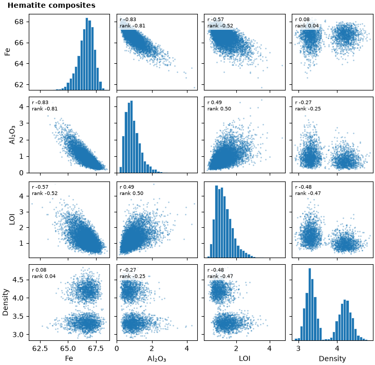
plot.scatter_matrix shows the pairs behind the numbers: scatters off the diagonal, histograms on it, and in each
panel the pearson (r) and rank correlation of the pair. columns= picks and orders the columns. density was measured
on only part of the composites, and each panel uses those where both of its values are present.
columns = ["FE_PCT", "AL2O3_PCT", "LOI_PCT", "DENSITY"]
print(f"density measured on {np.mean(~np.isnan(hematite['DENSITY'])):.0%} of the hematite composites")
fig, axes = bt.plot.scatter_matrix(hematite, columns=columns, labels=["Fe", "Al₂O₃", "LOI", "Density"])
fig.suptitle("Hematite composites", x=0.02, ha="left", fontweight="bold", fontsize=10)
save(fig, "scatter_matrix")
Out:
density measured on 40% of the hematite composites
density splits into two groups that Fe does not separate: friable and compact hematite, alike in grade and unlike in density. density follows the rock type, so a regression of density on Fe would miss it.
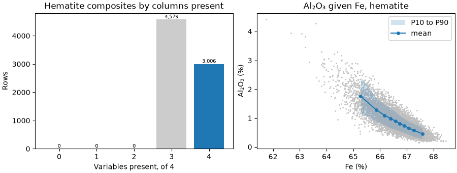
plot.completeness counts the composites by how many of the columns they hold, the complete ones in color.
plot.conditional draws the mean of one column and its P10 to P90 in bins of the other, each bin holding a tenth of
the composites, which shows the relation that a dense scatter hides. Al₂O₃ falls steadily as Fe rises, and its spread
narrows in the richest ore.
fig, (a, b) = plt.subplots(1, 2, figsize=(9, 3.4), layout="constrained")
bt.plot.completeness(hematite, columns=columns, ax=a)
a.set_title("Hematite composites by columns present")
bt.plot.conditional("FE_PCT", "AL2O3_PCT", data=hematite, ax=b)
b.set(title="Al₂O₃ given Fe, hematite", xlabel="Fe (%)", ylabel="Al₂O₃ (%)")
b.legend(loc="upper right")
save(fig, "completeness")
h-scatterplots
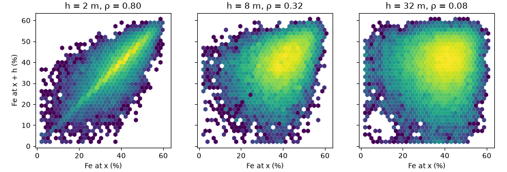
h_scatter gives the correlation of a grade with itself a lag apart. it pairs the composites separated by lag
within tolerance, in any direction unless you give an azimuth, and returns the values at both ends with their
correlation. as the lag grows the cloud widens and the correlation drops, the mirror image of the variogram rising.
fig, axes = plt.subplots(1, 3, figsize=(10, 3.4), layout="constrained", sharey=True)
for ax, lag in zip(axes, [2.0, 8.0, 32.0], strict=True):
    head, tail, r = bt.h_scatter(itabirite, "FE_PCT", lag, 0.1 * lag)
    print(f"h = {lag:>3.0f} m: {len(head):>6} pairs, correlation {r:.2f}")
    ax.hexbin(tail, head, gridsize=30, bins="log", linewidths=0)
    ax.set(title=f"h = {lag:g} m, ρ = {r:.2f}", xlabel="Fe at x (%)", aspect="equal")
axes[0].set_ylabel("Fe at x + h (%)")
save(fig, "h_scatter")
Out:
h =   2 m:  18924 pairs, correlation 0.80
h =   8 m:  21880 pairs, correlation 0.32
h =  32 m:  66886 pairs, correlation 0.08
Fe in itabirite correlates at 0.80 between neighboring composites, 0.32 at 8 m and 0.08 at 32 m. the bands that make the grade are thin, and beyond a few tens of meters a composite says little about the Fe of its neighbor. the variogram (experimental variograms) measures the same loss of correlation lag by lag.
Total running time of the script: ( 0 minutes 1.268 seconds)
Download Python source code: example_03_11.py